Inquisitor's Promise After Action Report 2.0: Electric Boogaloo (Article)
The journey in self-publishing my novel.
Author’s Note: A while back, I told
about writing this when she was asking about the experience of self-publishing a novel. Well, it’s finally here.Readers might remember that I’ve published an After-Action Report (AAR) of Inquisitor’s Promise in Germanicus Publishing a few months ago. That was soon after I released the final chapter of what was then my web novel. If you haven’t read that one, feel free to check out the link below:
But as I said at the end of the article, my work with the novel was not yet done. It took some time, but I’ve managed to release Inquisitor’s Promise as a bona fide novel on Amazon1, both as an e-book and as a printed book. Feel free to check them out below:
From Web Novel to Actual Novel
As readers may expect, I have made some changes to Inquisitor’s Promise from the initial web novel version to the actual book version. All in all, the changes were minor. It was mostly grammar fixes, some line editing, and some additional details here and there based on the feedback that I’ve received. But in terms of the plot, the book remained the same.
But as it turned out, it wasn’t the story editing that took much of my time. No; rather, it was the formatting. I spent so much time editing my file from Standard Manuscript Format and into a more readable format. In and of itself, this is fine. Formatting takes work, after all.
The problem was that I dove into this without really thinking what I was getting myself into. I figured that I’d just look up what I was supposed to do on YouTube and then voila. Indeed, this technically worked out as I was able to watch a video by YouTuber David V. Stewart on how to convert your manuscript into an e-book for Amazon KDP:
I took some time studying this and then applied what I learned. To make a long story short, I was able to release the Kindle version of Inquisitor’s Promise on August 9, 2023. At the time, I thought it would not take that much time to simply convert my Ebook into a printed copy.
Boy was I wrong!
From E-Book to Printed Book
When my book was released on Kindle, I felt really satisfied. To be able to read my own novel on the Kindle app was just great2. But then I discovered something really terrible in my book.
I found typos.
Thus, I spent so much time correcting typos. It would be one thing if I just did it once and be done with it. But I did this multiple times. It seemed like typos just somehow snuck its way into my book after I click publish. It was bizarre.
I also discovered that Amazon is really particular about its region. I’ve had friends and family who wanted to buy my book but couldn’t because Amazon Kindle doesn’t have a service in Indonesia, so people there couldn’t buy it.
This might seem trivial, but this actually led me to also put this book in both Laterpress and Lulu.
Remember what I said about the typos? Well, I discovered them after I uploaded the book to those platforms too. This meant that I have to fix three different manuscripts. This was definitely a pain.
At some point, I decided that enough is enough. Thus, I decided to start the work in converting my e-book into a paperback. Once again, David V. Stewart came to the rescue, and I watched through his video showing me how to format a paperback book for Amazon KDP:
But formatting them turned out to be more difficult than I had anticipated. It also didn’t help that Mr. Stewart’s video had him do all the things he did in an older version of Microsoft Word than mine. It took some tinkering, but I was able to get my manuscript formatted into what I wanted.
With the formatting done, I then ordered a proof copy and used it to do one final editing run. And believe me, that took a while too. Trying to scrutinize every bit of my book is not fun, especially when you have OCD tendencies.
But after much work, I was finally able to release the paperback version of Inquisitor’s Promise on August 28, 2023. As readers might tell, that’s quite a time gap between the two versions.
Moral of the Story
The funny thing about this whole process is that what I thought would be simple turned out to be difficult and what I thought would take some time turned out to be stupidly easy. I already mentioned how the formatting process turned out to be more painful that I had anticipated. On the other hand, getting a cover turned out to be very easy.
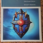
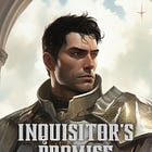
Readers of my Substack may know that I use Midjourney to generate images for my stories. I decided to do the same for the novel’s cover image too. And with the use of Canva, I was able to create the cover that I used for the final version of Inquisitor’s Promise.
Of course, I’m new to this game so I’m fully aware that it’s not the best cover possible for my novel. Not by a long shot. But the fact that I was able to get it done in such a short time is amazing.
But the most important takeaway from the whole process is that I should just have a single manuscript which then could be formatted for both the e-book and the paperback versions. Then I can release both versions at the same time.
I’ve wasted so much time releasing these versions piecemeal. Not just in the formatting, but also when I had to fix the typos that I ran across.
Moving Forward
Self-publishing my novel had been quite the experience. To be honest, I should have been more prepared instead of just winging it. What’s done is done, though. I definitely learned my lesson for the future. I’m by no means done with novels, and I’m hoping to release more of them in the future.
As for Germanicus Publishing, I’ll be doing away with the fiction/non-fiction rotation. It served its purpose but at this point, it’s just an unnecessary restriction on my publishing schedule. I’ll still be posting weekly on this Substack. Whether it be short stories, flash fiction pieces, articles, or reviews, I’ll be publishing whatever fiction-based stuff as I see fit. However, fiction will still be the bread-and-butter of this publication and I’ll make sure to post fiction at least once a month.
Before I end this, I would like to give some shout-outs to people who have helped me with this book:
Joseph Wiess, writer of
- the first guy that I know of who read through Inquisitor’s Promise from start to finish. To know that there is someone who read through my book and loves it is a really awesome feeling. Joseph’s comments are a treasure to me, and I took them into consideration in my later rounds of editing.- - as I was working on Inquisitor’s Promise, he had been plugging my stuff. He also sent me an e-mail feedback which I found useful. Furthermore, he was active in my chat and gave me some advice/feedback on formatting and the cover image.
Carlos Carrasco, author of Faith and Empire - he was one of my earlier readers. He left me a comment that helped me with editing. His positive comments for Act One of the novel was the initial confidence boost that I ever got as a writer. I would have linked his Substack, but he took it down a while ago.
And many others - this list is by no means exhaustive. There are many more who helped me see this project through in various ways.
Thanks for reading my AAR of Inquisitor’s Promise. To buy the novel, click the links down below:
Don’t forget to like, subscribe, and share. Also, feel free to support my work. I appreciate every bit of support.
As well as Lulu and Laterpress
In fact, I still do it from time to time. Especially in the slow hours of work.


Insightful article. I have considered bundling a lot of my One Shots together into an anthology but the formatting for ebook and print has deterred me thus far.
The title typeface is brilliant, really suits the aesthetic. I actually like the cover, it stands out from the majority of covers currently on shelves and has a distinct feel.
Typos sneak in after publication, some sort of nefarious spirit or fae creature must do it because no matter how many times I read through my own stuff one inevitably appears. Stray apostrophes too.
Thanks for sharing the self-pub journey and congratulations on the release.
I read it through, bought the book on Amazon, and will re-read it again when I get time.
Yeah, the formatting on Kindle is whack, that's for sure. I've just about figured out that actual formatting doesn't help, as the ebook will read from top to bottom without changing.
Hey, I Figured out page breaks at the end of chapters in order to put the chapter header at the top of the pages.